Yimika Osunsanya

A logistics platform that unifies scheduling, vendor coordination, and storage management with AI
My Role
Product designer: Visual design, Interaction design, User flows, UX research, User validation
My Team
4 software engineers, 1 designer, CEO
Timeline and status
4 weeks, June 2025
Overview
Construction sites are in constant motion. Deliveries arrive by the hour, subcontractors juggle priorities, and critical equipment often goes missing at the exact wrong time. Superintendents are left piecing everything together across calls, texts, spreadsheets, and vendor portals.
I designed a logistics platform that brings scheduling, vendor coordination, and storage management into one AI-powered system — built to save time, reduce chaos, and empower the people who build our world.
A platform designed to save time, reduce chaos, and unlock clarity in the last mile of construction logistics.
Highlights
Although my contract ended before the full launch of the project, I worked to establish success projections
Projected Impact
30%
fewer delivery conflicts
5-10 hrs
saved weekly
40%
faster sub coordination
25%
reduction in late rental fees

Problem
On-site, superintendents are the nerve center
But their current tools are fragmented: spreadsheets, texts, vendor portals, and phone calls.
Construction superintendents juggle constant variables: crews, subcontractors, deliveries, equipment, and safety. A single missed delivery or unavailable crane can halt work, costing thousands.
Fragmented tools and communication channels cause;
-
Deliveries to arrive without space or equipment ready for them.
-
Crews to wait idle, wasting hours.
-
Scattered subcontractor communication.
-
Expensive rental equipment to be scheduled too late,
or not at all.

Text: Complex communication process in construction
Mapping the day-to-day of a field superintendent on a construction job site
I started by mapping the superintendent’s workflow. Mornings were consumed with firefighting: deliveries uncoordinated, storage already full, equipment arriving late. Before work even began, site leads were scrambling to confirm what deliveries were actually coming, whether there was room in storage, and if unloading equipment could be sourced in time. Chaos was routine.

Image: Journey Map
The Challenge
Tracking isn’t enough, the system must anticipate
The solution needed to go much beyond recording schedules
The solution had to detect conflicts e.g.
If a large steel delivery was scheduled, Kaya AI would:
-
Flag storage availability
-
Begin sourcing unloading equipment (e.g., cranes, forklifts) from partner rental companies
-
Suggest optimal times for equipment delivery to site before materials arrived
-
Remind subcontractors to coordinate around delivery windows
This turned AI from “helpful reminder” to logistics coordinator, ensuring that equipment, crews, and deliveries worked in harmony.
Screens were built mobile-first, optimized for quick decisions in the field, with desktop providing a higher-level planning view.
Ideation
Starting with the main user path
I mapped four core tabs — Home, Calendar, Inbox, and Deliveries — each designed around the superintendent’s mental model.
Research suggests that people want to be actively involved in their loved ones' lives. Technology can help by providing reminders to stay connected, share updates, and schedule video calls. This proactive approach aims to maintain strong emotional bonds, even when people are far apart. The tool could help users establish a communication rhythm, reducing feelings of neglect, worry, and anxiety that can arise from infrequent contact. Figure 1 shows the current experience, while Figure 2 illustrates a potential solution.
Fig 1.


Image: 2 of 4 user flows mapped
But every good thing starts with wireframes
Low-fidelity wireframes helped validate flows before investing in visuals. I tested layouts for quick-glance summaries (e.g. Today’s Deliveries) and AI nudge placement.

Image: Wireframes
User flows
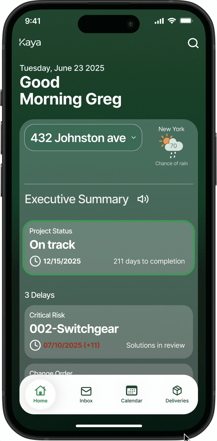
An executive summary was necessary
A quick week snapshot acts as a superintendent's executive assistant every morning. We considered what a field operator would need to know every morning to efficiently navigate the day. Then we looked into the best way to showcase this information to the user. Fig 1 below shows the initial concept developed and Fig 2 shows the design after user feedback
Fig 1.

GIF: Iteration 01
Fig 2.
GIF: Iteration 02
Buttons were mis-tapped due to proximity
Due to the button placement, I realized a lot of users did not accurately tap on desired buttons on the first try
Large text aids accessibility
As most superintendents are above 45 years of age, the need for larger text and larger buttons was mentioned by users
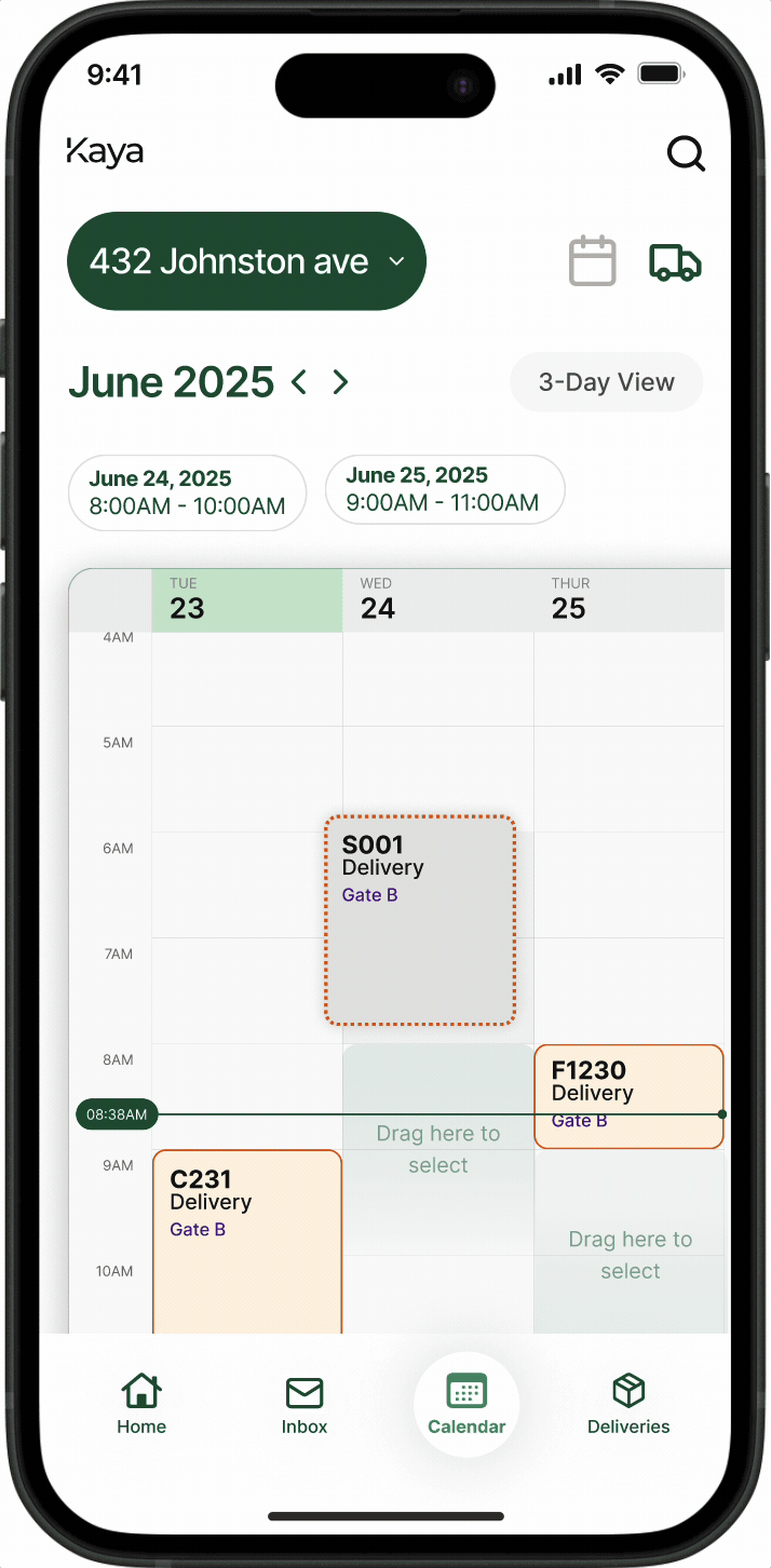
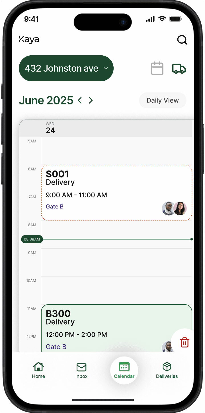
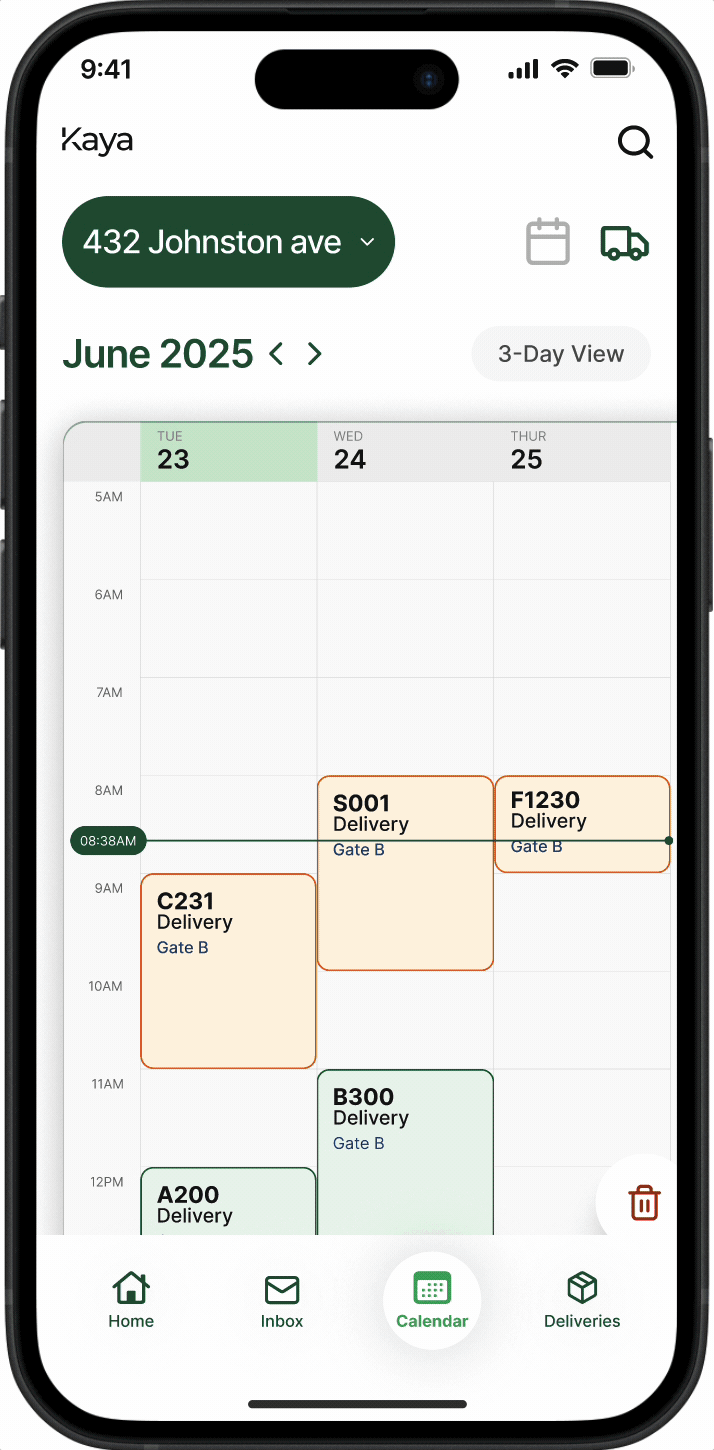
The calendar was the backbone of the
entire experience
The calendar presents a unified view of events, tasks, and deliveries. AI suggests optimal rescheduling when tasks aren’t started. The calendar scrolls endlessly and offers 3 modes for user control. Fig 1 shows transitioning through the 3 modes. Fig 2 shows approving a delivery suggestion and Fig 3 shows choosing a new time for a delivery
Fig 1.

GIF: Low-fi prototype prompt notification
Fig 1.
GIF: Low-fi prototype prompt notification
Fig 1.

GIF: Low-fi prototype prompt notification
...and AI's job was to surface suggestions and conflicts pro-actively
Following mental models established by other AI models, a conversational design was employed. Fig 1 shows an earlier iteration of the design
Fig 1.
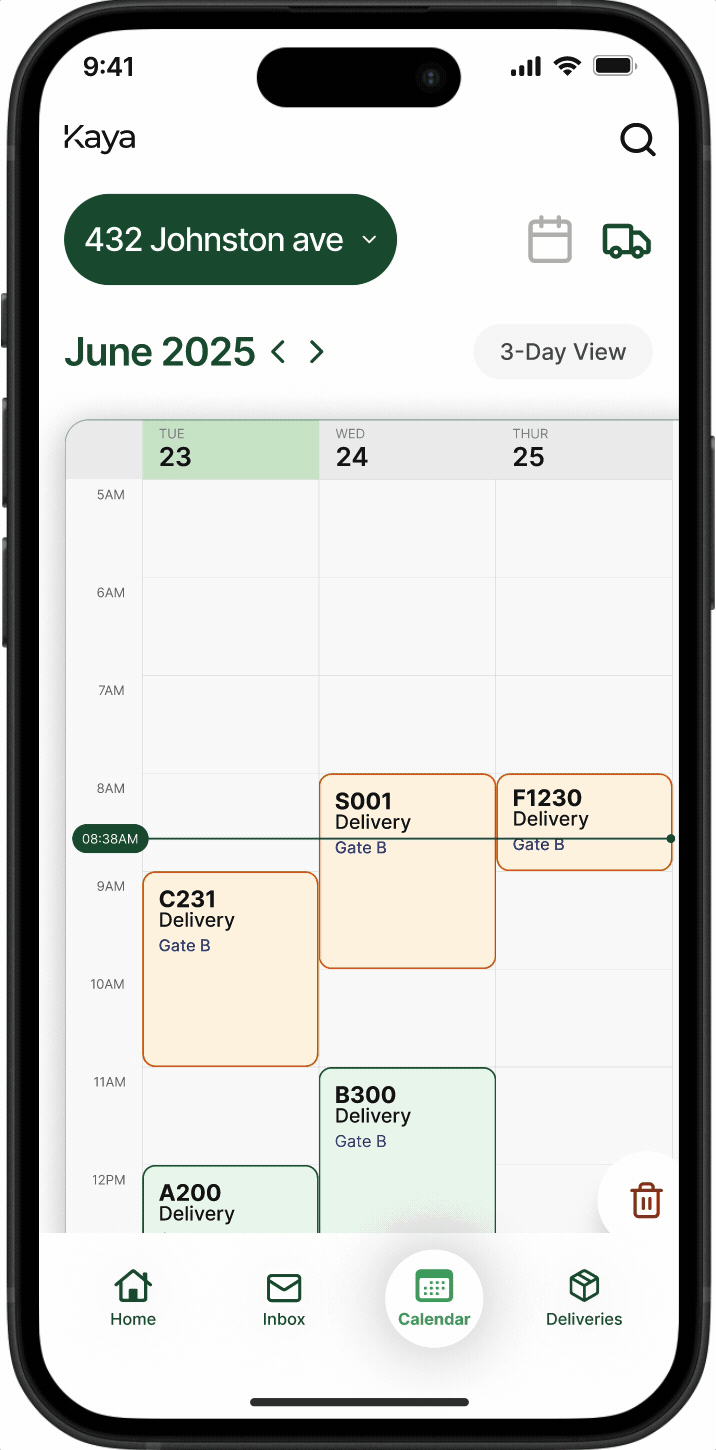
Fig 2.
Too many details, no confirmation
This iteration presented all information about rentals in a tabular format which required users to zoom in and make decisions without confirming the details of the rental first
Progressive details, controlled steps
The details in this iteration were staged over more than 1 step allowing a user to fully digest the rental equipment they will be ordering. A slider is used to ensure user does not accidentally book a rental
With deliveries which could be mapped by location for ease of offloading
Deliveries could be filtered by location, submittal logs and other data to enable the superintendent finely map out deliveries on site
Fig 1.

GIF: Finding deliveries
Retrospective
What I learned
Designing for Scale, Learning from Speed
I wasn’t on this contract long enough to gather live performance metrics, but I designed with measurable outcomes in mind. Success would be evaluated by reductions in logistics delays, equipment idle time, and superintendent coordination hours saved. If implemented fully, these KPIs could be tracked via delivery logs, rental confirmations, and site productivity data.
This project reinforced how powerful design becomes when it tackles hidden bottlenecks. Logistics isn’t glamorous, but solving it directly impacts cost, safety, and trust on the job site