Yimika Osunsanya

_edited_edited_edited.jpg)
WALTER educates city resident's on their water quality inspiring them to curb plastic bottle usage
My Role
Product designer: Physical/Industrial design, Visual design, Interaction design, User flows, UX research, Prototyping, User validation
My Team
Masha Konopleva, Design lead
Stefani Fachini, Design
Jetnipat Phruttinarakorn, Design
Ryan Lewandowski, Design
Amy Mielke, Design
Cesar Neri, Computational engineering
Alan Cation, Computational engineering
Overview
WALTER (Water Alert and Testing Resource) is a proposed spatial device crafted with the purpose of transparently communicating drinking water quality to New York City residents. WALTER seeks to bridge the information gap between water suppliers and the public, utilizing existing infrastructure to relay real-time water quality and consumption data at a neighborhood level. The objective is to instill renewed trust in water quality, fostering local pride, reducing plastic consumption, and enhancing public stewardship of our water systems. Leveraging pre-existing infrastructure, WALTER can be efficiently deployed throughout the city.
Timeline and status
2 months Presented in December 2023
Highlights


Context
Use of plastic bottles is on the rise
Several NYC residents have expressed a distrust in the quality of water in their homes
In recent years, instances of municipal water contamination have become more prevalent. Despite over 90% of the United States having access to safe drinking water, there has been a noticeable surge in the consumption of bottled water. Could this upswing be indicative of a growing lack of trust in our tap water?

Image: Map of reported instances of water contamination in the USA
... But NYC has taken significant steps to ensure the cleanliness of their water
NYC has several water sampling stations throughout the city. The existing sampling station is an enclosed faucet on the street where water samples can be taken for testing. These stations are consistently tested by the Department of Environmental Protection (DEP) to ensure it meets the acceptable water quality standard set by the Environmental Protection Agency (EPA). This relationship is diagrammed in Fig 1. While Fig 2 shows where in the city these stations are currently located
Fig 1.

Image: Diagram of relationship between key players
Fig 2.

Image: Map of sampling station locations in NYC
Problem
Lack of real time information leads to distrust
Although water quality information is available it is not publicized
63,000,000 Americans have been exposed to unsafe water more than once over the last decade due to a lack of real time information which has led to the public's distrust of their water. Although NYC has some of the cleanest water in the country, the residents are not being shown this information in a way that encourages them to drink from their faucets

Image: NYC water quality yearly report
The Challenge
Create a water quality awareness tool
Craft a tool leveraging the extensive network of 965+ water sampling stations scattered across the city
Basic design principles
Real-time
The solution must carry out data analysis in realtime to reassure residents of the current nature of their information
Accessible
The solution must be attractive and accessible to the public to ensure information is publicized and easy to understand
Actionable
The solution must empower residents to address any issues which may arise as they navigate water quality information
Ideation
What quality metrics are most useful to show
Water providers test for a myriad of contaminants- almost a hundred in number
Guided by the Environmental Protection Agency's (EPA) stringent standards, water providers test for contaminants. However, two in particular, lead and nitrate, command special attention due to their potential impact on the well-being of city residents alongside other quality indicators such as PH and total coliform. In total 7 contaminants were deemed key to show upon discussing with experts in the field. Those key categories are; pH, Total Coliform, Lead, Nitrate, Chlorine, Fluoride and water hardness. They are represented below with the yellow dots illustrating NYC's 2018 levels

Image: Diagram showing quality standard for key water contaminants
So it was key to create a way to allow the public test and view the quality of their water
WALTER needed to be a spatial device poised to democratize water quality awareness. Leveraging the extensive network of 965+ water sampling stations scattered across the city, WALTER was crafted to serve as a catalyst for public engagement in the monitoring process. Residents, armed with this user-friendly tool, become active participants in the assessment and reporting of water quality within their communities.
To facilitate this participatory approach, design modifications take center stage. For WALTER, two design aspects were taken into consideration;
Physical Form Design
Digital Interface Design
To tackle physical design, the existing infrastructure needed to be studied
The installation of a top access box, not merely utilitarian but a hub of communication and technological sophistication, transforms the existing infrastructure. This evolution involves integrating a cutting-edge testing system, seamlessly encased in an aesthetically pleasing shell. Fig 1 shows a diagrammatic representation of the technology will need to be added to the existing infrastructure. Fig 2 & 3 show the simplified process by which the updates can be carried out
Fig 1.

Existing Infrastructure

Re-imagined Infrastructure
Image: Diagram of re-imagined infrastructure
Fig 2.

Existing Infrastructure

Removal of outer shell retaining test faucet
Image: Diagram of removal of existing infrastructure
Fig 3.

Addition of Water Quality Indication Equipment

Addition of New Outer Shell with Interactive elements

Addition of Surrounding program to make station a destination
Image: Diagram of addition of new infrastructure
“Having an art piece tell me about my water will be so cool”
Catherine
In order to create an interactive experience which draws the public's attention, WALTER's form and physical characteristics needed to be artistic. So I modeled different 3D forms which was then presented to users so as to analyze which option was most attractive
Option 1

Image: Geometric form shell
Option 2

Image: Open form shell
Option 3

Image: Parametric form shell
"Not interesting enough" -Abi
Users believed the facets were not novel
"Could be distracting" -Sharon
The open shell could cause distractions
"OOH fun!" -David
Users were mostly intrigued by this form
**Developed further for final concept
Physical form
Let's light up the streets!
Lights and parametric forms are the quickest ways to gain user’s attention
The final physical form combined the developed parametric form with the staple of NYC, lights! WALTER utilized LED lights to draw attention to itself but also as an interactive component of the testing experience. Fig 1, shows the color ways selected to indicate the quality of tested water


Image: Day & night form comparison
Fig 1.
Neutral, no water being tested
Water tested is safe to drink
Water tested is unsafe to drink

Image: Color indicators
User flows
Water is serious business
...So it was key to show users the right level of information
From research carried out, Users want to understand if their water is safe to drink in a single glance, as that’s the JTBD, and leave WALTER with a plan. Therefore, WALTER's user interface needed to enable individuals to learn about the cleanliness of their water through a short interaction on the street. Hence information must be broken into small chunks and interaction types must be utilized for hierarchy. Additionally due to the difference in abilities of individuals it was imperative to ensure that screens were accessible to individuals in wheelchairs


Image: Sketches of interface wireframes
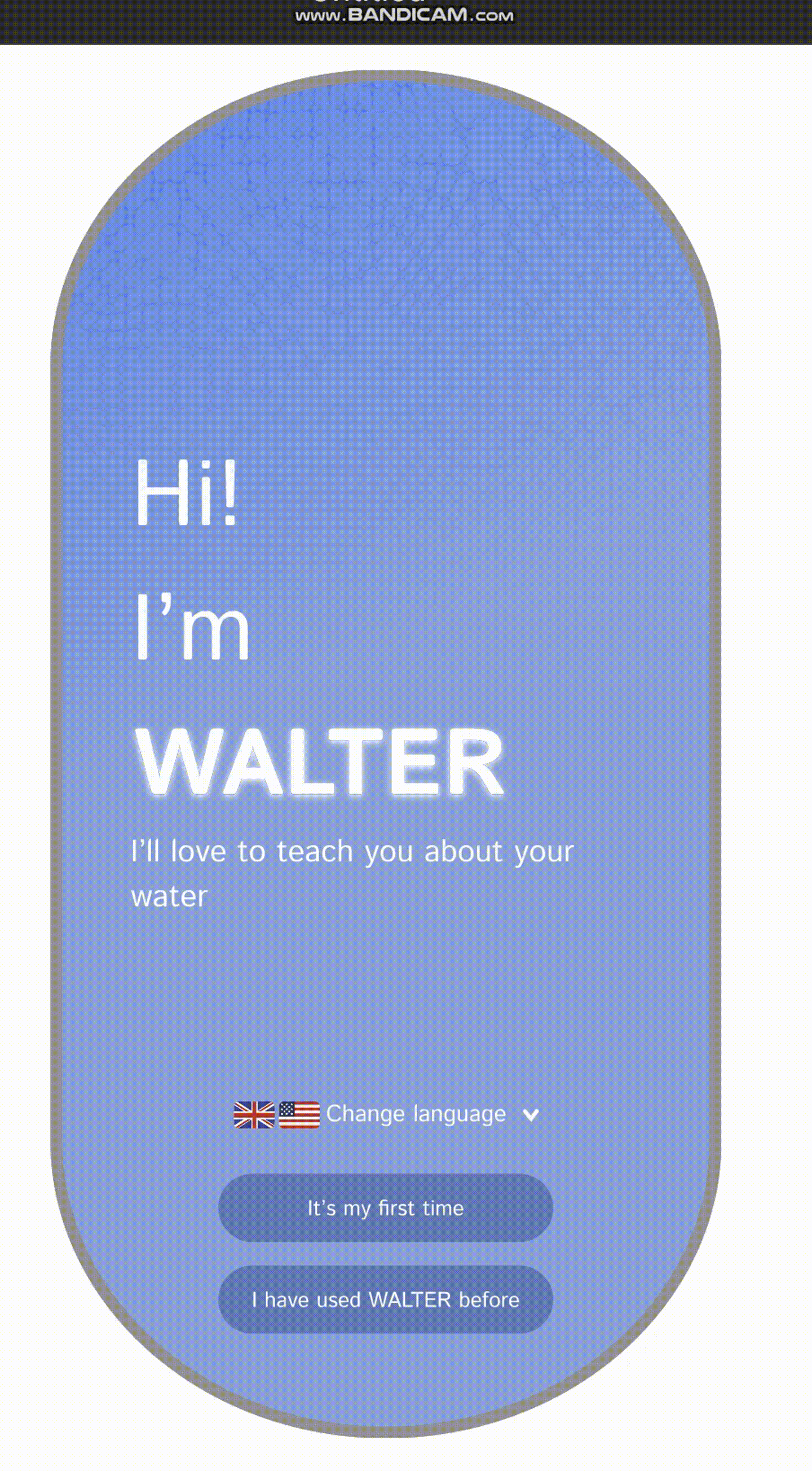
Firstly, the public needs to know what WALTER can do
Visitors to WALTER who do not have prior knowledge of the device need an easy way to understand the purpose of the device. The onboarding screens serve to introduce WALTER as a familiar face on the streets of New York
GIF: WALTER's welcome screen
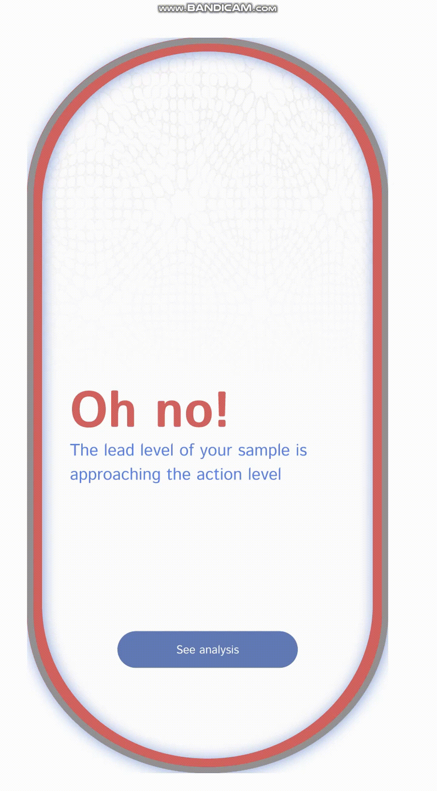
As testing is central to what WALTER offers, users must know exactly how to do this
To guarantee that WALTER visitors effectively navigate the device's testing features, pristine screens guide users through the proper sequence. Subsequently, users test their water, and the results are promptly communicated, indicating whether their sample is deemed satisfactory or requires attention. Fig 1 shows the safe notification screen while Fig 2 shows the unsafe screen
GIF: Testing a contaminated water sample

Fig 1.


Image: Safe water screen
Fig 2.


Image: Unsafe water screen
If a sample is unsafe to drink, its imperative for a user to know why & what to do
Upon discerning whether their water meets satisfactory standards or not, individuals can delve deeper to identify specific issues or disparities in their water in comparison to the city's standards. All worrisome contaminants move to the top of the screen to enable users easily track with the eye where the problem lies. After which, users are able to take actionable steps to rectify the situation
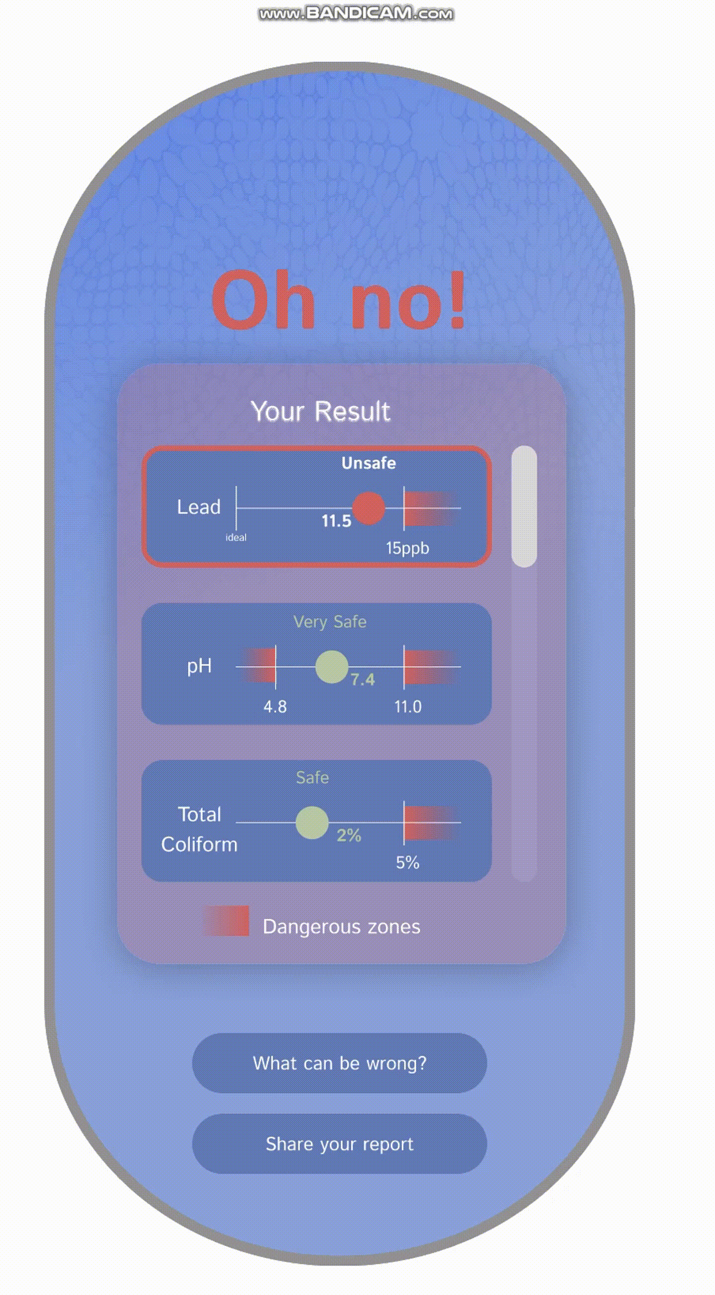
GIF: WALTER result screen
But do users prefer an older dial look which evokes a more physical interaction
Initially for this design, I utilized the style of device dials to create a more physical experience to WALTER. The analog feel was to make WALTER more approachable by individuals from a wide range of users with diverse technical abilities. On presenting a rounded dial option and a less rounded, less graphic option, users preferred the less rounded option
Fig 1.
Image: Safe water screen
.png)
Area of focus
The dark colors drew users eyes but information within them got lost as the background took center stage
Ease of understanding
The harsh rows make the page feel dense hence creating the illusion of more data on the screen
Fig 2.
Image: Unsafe water screen

Area of focus
The light background helps to enable users focus on the information on the screen
Ease of understanding
The screen looks less cluttered due to the simplicity of the laid out information and less harsh rows
Retrospective
What I would do differently
Test concepts at scale to generate accurate feedback from users
Because WALTER is a street device with a larger screen than most, testing interactions on a laptop was challenging. Moving forward, it's important to test how users interact with the full-sized screen to understand the necessary visual hierarchy and interactions.